Identity Is Not a Logo, It’s a Memory in Formation
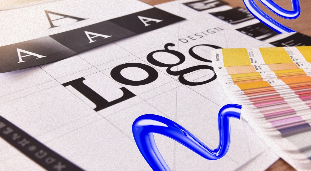
A logo is a symbol.
A brand identity is a living system. Identity doesn’t reside in a mark; it lives in memory, emotion and association. It’s formed slowly, through repetition and experience. Every interaction, every email, interface, product or moment of friction becomes a fragment of memory. Over time, those fragments assemble into trust, desire, loyalty or indifference.
Strong brand identity design services focus less on how a brand looks in isolation and more on how it feels over time. Recognition matters, but emotional recall matters more. People don’t remember what brands say about themselves. They remember how those brands made them feel when it mattered.
Emotion Is the First Language the Brain Understands
Emotion speaks first. Logic follows later, usually to justify what we already feel. This is why emotionally resonant brand identities cut through noise without force. They don’t argue. They connect.
Fear, hope, nostalgia, belonging these are not manipulative levers when used respectfully. They are natural human responses. Brands that understand this don’t beg for attention; they earn it. They create experiences that feel human rather than transactional, allowing emotion to open the door that logic eventually walks through.
At its best, brand identity isn’t persuasive. It’s familiar.
The Power of Archetypes: Why Familiar Stories Feel Safe
Humans are pattern-seeking by nature. We understand the world through stories and archetypes are the shorthand.
The hero, the guide, the rebel, the caregiver these roles aren’t cliches; they’re psychological anchors. Brands that align with a clear archetype feel instantly legible. We know how to relate to them without being told how.
When a brand knows its role in the customer’s story, it stops shouting. It starts resonating. A trusted brand identity agency doesn’t impose an archetype; it uncovers the one that already fits. When done right, the brand feels less like a company and more like a presence with a purpose.
Visual Identity as Atmosphere, Not Decoration
Visual identity is often misunderstood as surface.
Color, typography, spacing, motion these aren’t aesthetic flourishes. They are emotional cues. Like lighting in a film, visuals shape mood before meaning. You feel something long before you understand why.
Strong brand identity design services treat visuals as atmosphere rather than ornament. Consistency here isn’t about rigidity; it’s about emotional continuity. When visuals feel cohesive across touchpoints, recognition happens quietly. No repetition required. The brand becomes recognizable not because it’s loud, but because it’s familiar.
Voice and Tone: The Inner Monologue of the Brand
A brand’s voice is who it is when no one is watching.
Tone shapes intimacy. Calm, provocative, poetic, precise each choice signals personality. Brands that speak like humans are remembered like humans. Those that shift voices depending on the platform create dissonance and dissonance creates doubt.
Consistency in voice isn’t about cleverness. It’s about coherence. When words align with visuals and behavior, trust forms. The brand stops feeling like a campaign and starts feeling like a character people know.
Meaning Before Marketing: Purpose as the Core Signal
Campaigns expire. Purpose compounds.
Purpose-driven branding isn’t about virtue signaling or mission statements designed to impress. It’s about alignment between belief and behavior. When what a brand says matches what it does, emotion turns into loyalty.
Without meaning, even the most beautiful brand identity eventually feels hollow. A brand identity agency's role isn’t to invent purpose, but to clarify it then ensure it’s visible through action, not slogans. Meaning is the signal beneath all communication. Without it, marketing becomes noise.
From Emotion to Action: Designing for Movement, Not Admiration
Emotion alone isn’t enough.
If feeling doesn’t lead somewhere, it fades. Strong brand identities are designed for movement. They guide people naturally toward action purchasing, subscribing, sharing, advocating without pressure or confusion.
The best brands don’t just move hearts; they reduce friction. They make the next step feel inevitable. Design, messaging and experience align to remove hesitation. Admiration is passive. Movement is engagement.
Consistency Builds Trust, Repetition Builds Belief
Trust is built slowly, through repetition.
Every interaction either reinforces belief or weakens it. Consistency isn’t sameness; it’s discipline. It’s the repeated delivery of core signals across time and touchpoints that quietly say, “You know who we are.
”When brand identity is consistent, people stop questioning it. They rely on it. And belief, once formed, becomes hard to replace.
When Identity Becomes an Experience
At its highest level, brand identity disappears.
People stop noticing the branding and start feeling the experience. Identity no longer lives in guidelines or decks; it lives in moments, decisions and memories. It shows up when expectations are met, exceeded or challenged thoughtfully.
When brand identity triggers emotion and inspires action, it stops being branding and starts becoming culture. And culture, unlike campaigns, lasts.
In the end, the most powerful brands don’t announce who they are. They let people feel it again and again until meaning becomes memory.


