Snakara

(01)

TL;DR

Collaborators

Sanchi: Moodboard, Identity Design and Style Sheet

Sunaina: Identity Design and Packaging

A samurai’s guide to better snacking

A bold, character-led brand that makes clean eating fun, memorable, and totally ownable.

Mission

To build a health snack brand that feels local, sharp, and culturally fresh. Snakara needed a standout name, a strong identity, and packaging that could grow with every new flavour.

Outcome

We created the name Snakara, brought to life by a samurai mascot who watches over your snack choices. The visual identity is clean but expressive, with indigo and off-white as core colours. We designed packaging for four fox nut flavours with playful messaging and a flexible label system where only the hero ingredient changes.
(SERVICES RENDERED)

Concept and Moodboard

02

Identity Design

03

Style Sheet

04

Packaging Design

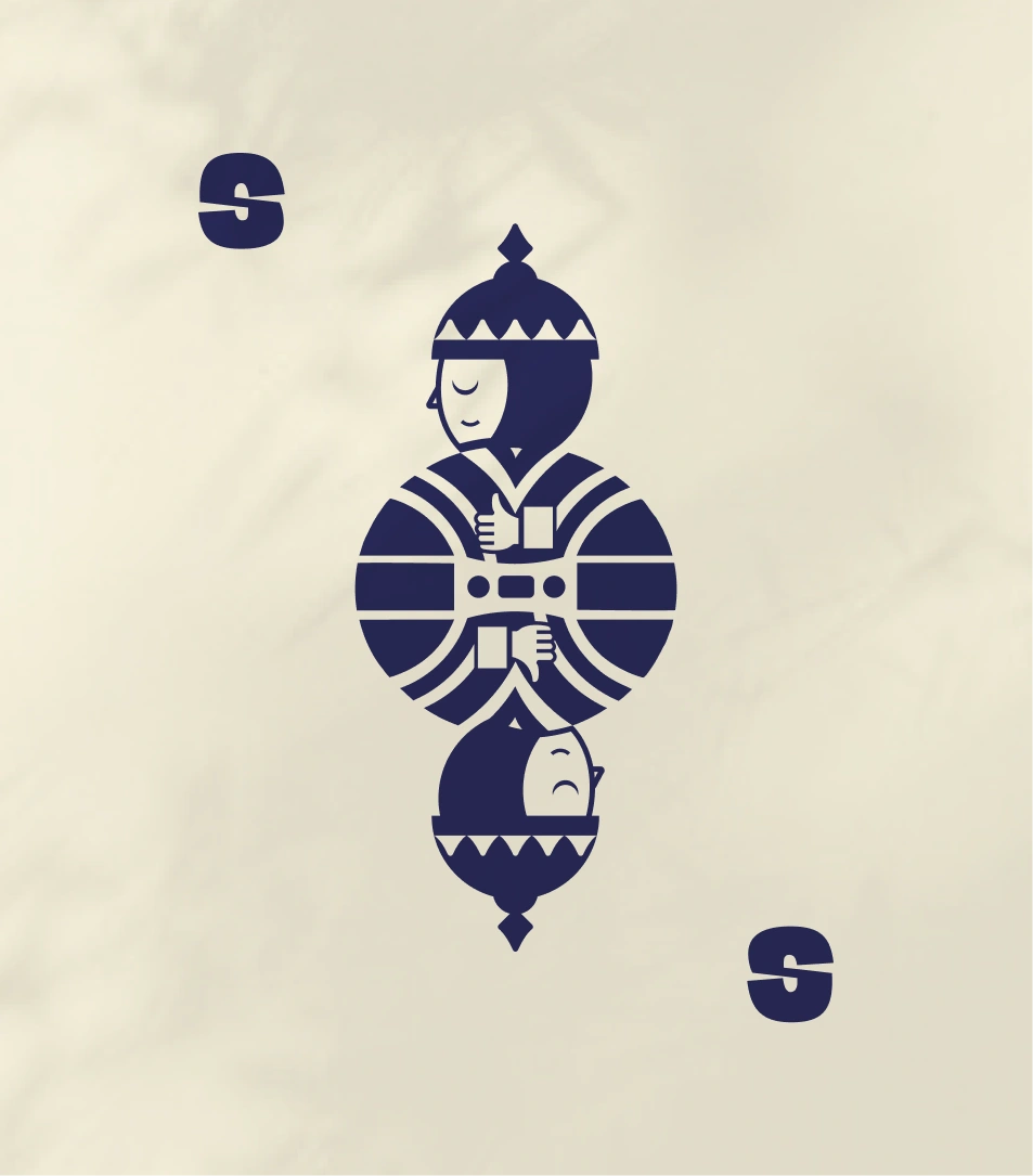
This image displays **Snakara’s brand mascot — the Snakara Samurai** — illustrated in a mirrored, minimal form. Rendered in bold navy blue against a soft cream background, the design captures balance, mindfulness, and duality — the calm guardian above and the reflective counterpart below. The symmetry and geometric lines evoke discipline and strength, mirroring the brand’s philosophy of mindful indulgence. The stylized “S” monogram on either side frames the mascot, reinforcing brand identity with simplicity and precision.

This artwork encapsulates Snakara’s core ethos — *the guardian of healthy snacking* — blending traditional symbolism with a modern, minimal aesthetic that’s instantly recognizable and deeply meaningful.
This frame displays Snakara’s core brand statement — **“The Guardian of Healthy Snacking.”** Set against a deep navy backdrop, the bold white typography creates immediate visual impact while communicating clarity and conviction.

The line encapsulates Snakara’s brand philosophy: combining mindfulness, nutrition, and flavor under the protective discipline of the “Samurai spirit.” It positions the brand not just as a snack company, but as a custodian of better choices — where balance, health, and taste coexist. The minimal layout and strong contrast reflect the same calm focus that defines Snakara’s identity: sharp, clean, and purpose-driven.
This image presents a **Snakara outdoor billboard** that boldly captures the brand’s personality — smart, modern, and unapologetically playful. The tagline *“The master of mindful munching”* positions Snakara as a brand that fuses indulgence with intention. The design features a minimalist composition with a deep navy background, bold typography, and the Snakara Samurai emblem — a guardian figure symbolizing discipline and balance. The bowl of roasted makhana in warm, golden hues contrasts beautifully with the cool backdrop, highlighting the product’s appetizing texture.

This visual encapsulates Snakara’s ethos: healthy snacking with character. It’s visually impactful, instantly legible, and designed to leave a lasting impression on urban commuters.
This image presents a navy-blue water bottle featuring Snakara’s Samurai emblem — a mirrored figure that embodies duality, mindfulness, and balance. The minimalist cream illustration stands out crisply against the matte finish, giving it a premium, composed aesthetic.

The design extends Snakara’s identity beyond packaging into lifestyle — practical, disciplined, and stylish. The Samurai motif reinforces the idea of **control and calm in everyday choices**, while the clean symmetry of the artwork makes it feel collectible rather than promotional.

It’s not just merchandise; it’s a **brand artifact** — a reminder of Snakara’s philosophy: mindful living through small, thoughtful decisions, from the snacks you eat to the things you carry.

Challenge

The brand needed to feel fun but not juvenile, healthy but not preachy. It had to appeal to snackers looking for better choices, without losing the excitement of indulgence. Snakara also needed to be easy to extend across future formats, flavours, and categories.

This image showcases a **vibrant advertising campaign for Snakara**, a modern snacking brand. The centerpiece features a striking product visual — a transparent jar of *Roasted Makhana Cheese Burst* surrounded by flying cheese cubes and dynamic yellow splashes against a rich blue backdrop. The flanking posters highlight Snakara’s playful identity: the left features the brand’s mascot in a minimalist vector style with the tagline *“It’s Snakara O’ Clock,”* while the right promotes key benefits such as *“Gluten-Free,” “Roasted, Not Fried,”* and *“High in Protein.”* The cohesive color palette of deep blue, cream, and orange creates a bold, appetizing contrast, reflecting Snakara’s positioning as a fun, health-forward brand that makes mindful snacking exciting and energetic.
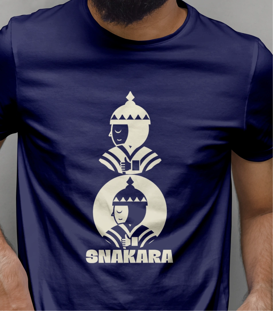
This image showcases Snakara’s brand applied to apparel — a deep navy t-shirt featuring the Samurai mascot in a bold, minimalist print. The stacked composition of two Samurai figures, mirrored and centered, adds symmetry and balance, reinforcing Snakara’s design language of discipline and calm control.

The cream-on-navy contrast mirrors the brand’s signature color palette, while the geometric precision of the illustration reflects the same thoughtful restraint seen across the identity. The large **SNAKARA** wordmark grounds the design, giving it a confident, modern presence. This isn’t just merchandise — it’s wearable branding that turns the Samurai ethos into a lifestyle symbol: mindful, strong, and quietly powerful.
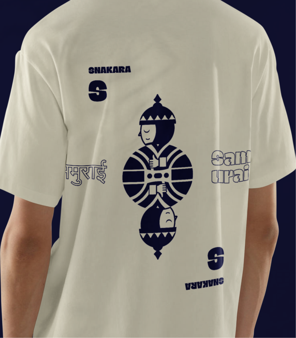
This image showcases **Snakara’s branded apparel**, blending streetwear with brand storytelling. The T-shirt design features the signature *Snakara Samurai* mascot in a mirrored illustration, flanked by multilingual typography — “Samurai” in English and Hindi — creating a cultural bridge between contemporary and traditional influences. The composition is playful and bold, with the “S” monogram and logo strategically placed to balance the visual rhythm. The navy-on-cream color palette keeps the design minimal yet impactful, staying true to Snakara’s core aesthetic of confident simplicity.

This kind of merchandise reinforces the brand’s visual identity beyond packaging — transforming Snakara into a lifestyle statement for the health-conscious yet style-forward audience.

This character became the soul of the brand. He’s present across packaging and communication. Sometimes serious, sometimes cheeky but always watchful.

Our Approach

We started with the name. Snakara is inspired by a disciplined, fictional samurai who appears at snack hour to keep your choices in check. He’s your internal voice of reason, nudging you toward eating right, especially around 5PM when cravings hit hardest.

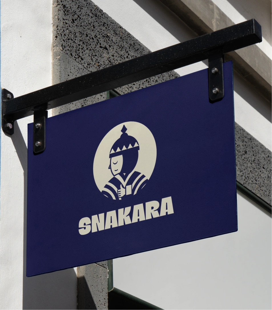
This image displays **Snakara’s outdoor brand signage**, featuring its signature mascot and bold logotype. The signage is mounted on a black metal bracket against a modern white and grey building facade, exuding a crisp and urban aesthetic. The deep navy-blue background contrasts elegantly with the ivory illustration of the *Snakara Samurai* — a stylized guardian figure that embodies the brand’s spirit of mindful strength and everyday balance. The thick, confident typography below enhances visibility and impact, making the logo instantly recognizable. This visual captures Snakara’s essence as a contemporary Indian snacking brand that blends tradition, character, and modern design sensibility in every detail.
This image presents **Snakara’s brand manual**, a refined visual representation of its philosophy — *“The way of the sharp mind.”* The minimal beige cover, contrasted with deep navy graphics, mirrors the brand’s balance between mindfulness and strength. The bold arcs evoke motion and focus, while the Samurai insignia on the top left reinforces discipline, precision, and guardianship — core values of Snakara’s identity.

The composition exudes quiet confidence, aligning with Snakara’s tone: thoughtful, bold, and purpose-driven. It’s more than just a design guide; it’s a declaration of the brand’s ethos — merging heritage-inspired storytelling with modern visual clarity.
This image showcases Snakara’s **packaging and tape design**, built around a bold interplay of geometry and repetition. The signature navy-and-cream palette anchors the identity, while the rounded wave pattern adds rhythm and motion, hinting at both energy and mindfulness — a perfect metaphor for Snakara’s balance between indulgence and control.

The repeated Samurai emblem reinforces consistency, acting as a visual “seal of guardianship.” The packaging tape, instead of being purely functional, becomes part of the storytelling — symbolizing protection, care, and the brand’s quiet assurance that every box carries something thoughtful inside.

Overall, it’s a strong example of **branded minimalism**: restrained yet confident, creating instant recognition without excess.
This image features **Snakara’s Roasted Makhana Fiery Peri Peri** flavor, a bold and vibrant representation of the brand’s modern snacking identity. The packaging design uses a clear cylindrical jar with a minimal label in red and cream, showcasing the product’s visual appeal through transparency. The label highlights key benefits — *Gluten-Free, 9g Protein, 14g Fiber, Roasted Not Fried, and Superfood* — communicating health with clarity. The Snakara Samurai mascot stands proudly at the top, symbolizing mindful strength and protection in everyday choices. The clean composition, paired with playful typography and fiery graphics, captures the perfect balance between fun and functional — making healthy snacking feel exciting, flavorful, and contemporary.
This image cleverly extends Snakara’s visual identity into lifestyle branding. The two deck chairs—printed in the brand’s cream-and-navy palette—transform Snakara’s philosophy into a casual, human moment.

The left chair, reading **“Relax. Recharge. Refuel.”**, distills the brand’s functional promise: balance, energy, and restoration. The right chair, with **“Snakara’s Got Your Back”** paired with the Samurai mascot, reinforces its persona—the mindful guardian looking out for your well-being.

This design smartly blurs product and lifestyle, turning a snack brand into a state of mind. It’s not just selling food; it’s selling calm, confidence, and a quiet sense of discipline.

The visual language is built around a deep indigo paired with a soft off-white. The design system is clean, confident, and designed to scale. Each pack features the key ingredient illustrated in a bold, graphic style. All other elements like the logo, layout, tone and stay consistent across SKUs, making it easy to grow the product line without compromising brand recognition.

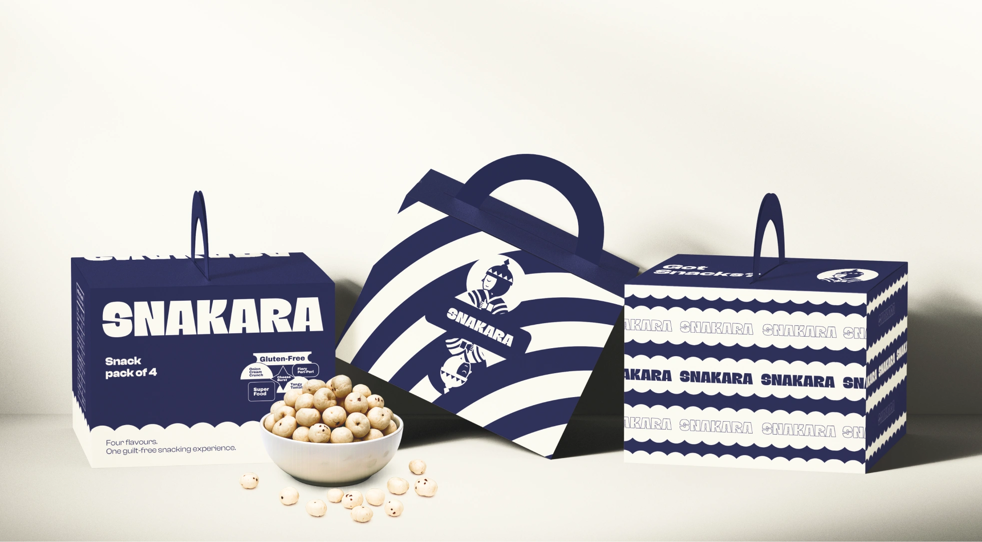
This image captures Snakara’s **packaging lineup** — a visual symphony of navy and cream that turns everyday snacking into a ritual of mindfulness. Each box features clean typography, balanced geometry, and the signature Samurai icon, reinforcing the brand’s ethos of protection, focus, and conscious consumption.

The design blends **discipline with delight**: bold stripes suggest motion and confidence, while rounded motifs bring warmth and approachability. The structured handles and stackable forms make the packs practical yet collectible.

In essence, this isn’t just packaging — it’s brand storytelling in three dimensions. Snakara positions itself as **the guardian of guilt-free snacking**, combining taste, health, and thoughtful design into one cohesive visual language.
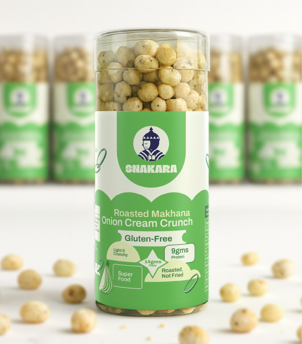
This image highlights **Snakara’s Roasted Makhana – Onion Cream Crunch** in its signature cylindrical jar. The packaging design balances health cues with modern aesthetics, using a fresh green and cream palette that communicates lightness and flavor. The front label features Snakara’s Samurai emblem — a symbol of discipline and mindful eating — along with clear nutritional highlights: *Gluten-Free, 9g Protein, 14g Fiber, Roasted Not Fried, Superfood.*

The matte texture, rounded typography, and minimal graphics give the pack a clean, premium look while staying approachable. Surrounded by scattered makhanas, the composition reinforces the brand’s promise of *healthy snacking made joyful*, designed for those who crave flavor without compromise.
This image features Snakara’s business cards — a striking fusion of **heritage and modern minimalism**. The alternating deep navy and warm cream tones echo the brand’s identity palette, while the Samurai mascot stands as a recurring emblem of mindfulness and discipline.

The typography is bold and utilitarian, reflecting Snakara’s confident, no-nonsense tone. Lines like **“The Samurai of Smart Snacking”** reinforce the brand philosophy: snacks designed with purpose, guided by balance. The repeated **SNAKARA** wordmark and clean layout give the design a premium yet approachable feel, while the embossed textures (visually implied through shading) elevate tactility and craftsmanship.

Altogether, this layout turns a simple card into a **brand statement** — calm, powerful, and intentional, mirroring the ethos of mindful snacking.
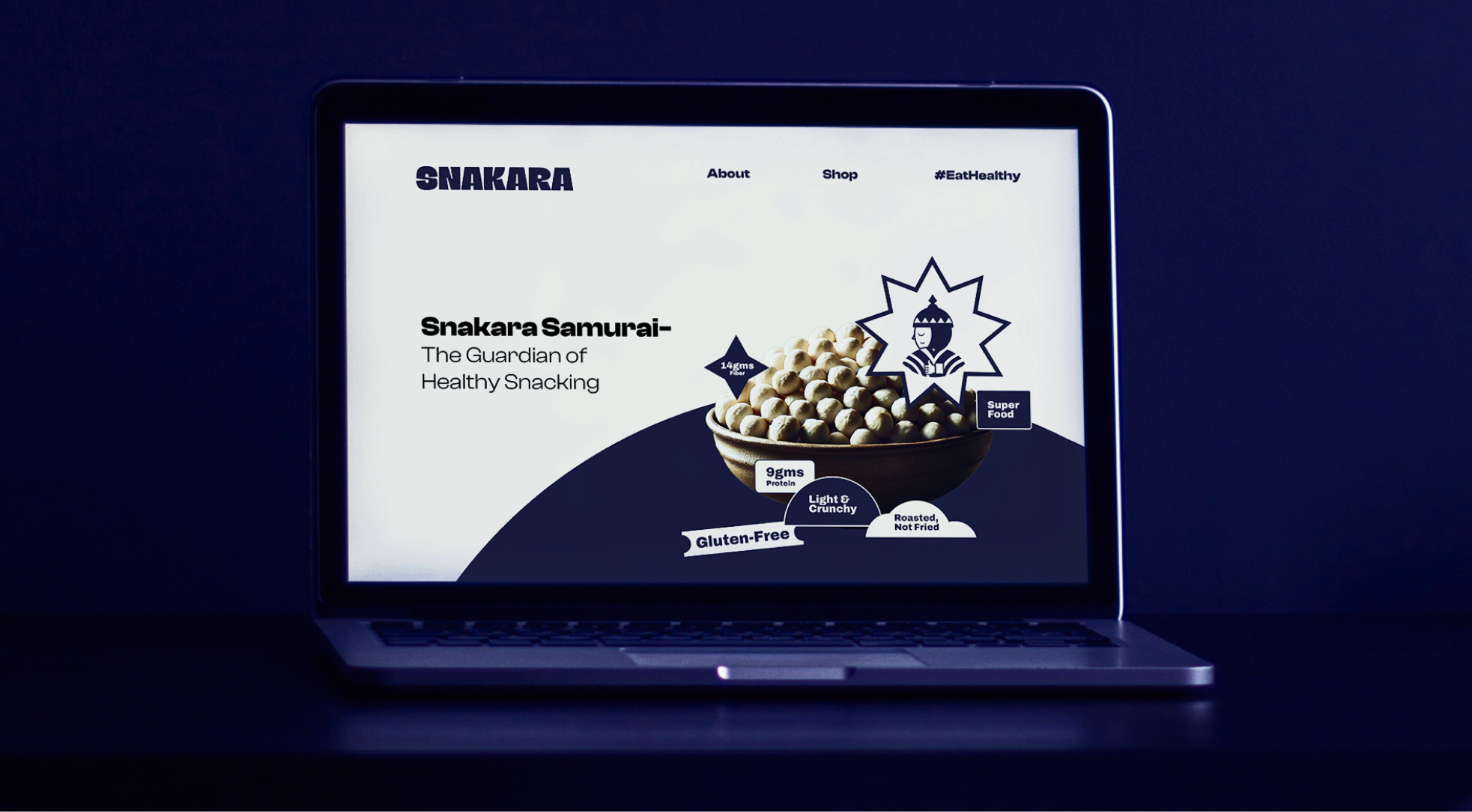
This image shows **Snakara’s website homepage**, introducing the brand’s playful identity and focus on healthy snacking. The hero section highlights the tagline *“Snakara Samurai – The Guardian of Healthy Snacking”*, reinforcing the brand’s mascot as a symbol of strength and mindful indulgence. The central visual features a bowl of roasted makhana (fox nuts) paired with key benefits—*Gluten-Free, Roasted Not Fried, 9g Protein, and 14g Fiber*. The minimal layout and bold typography in deep blue and cream create a modern, energetic aesthetic that feels both fun and premium. Overall, the design captures Snakara’s brand promise: health-forward snacking with an edge of confidence and character.
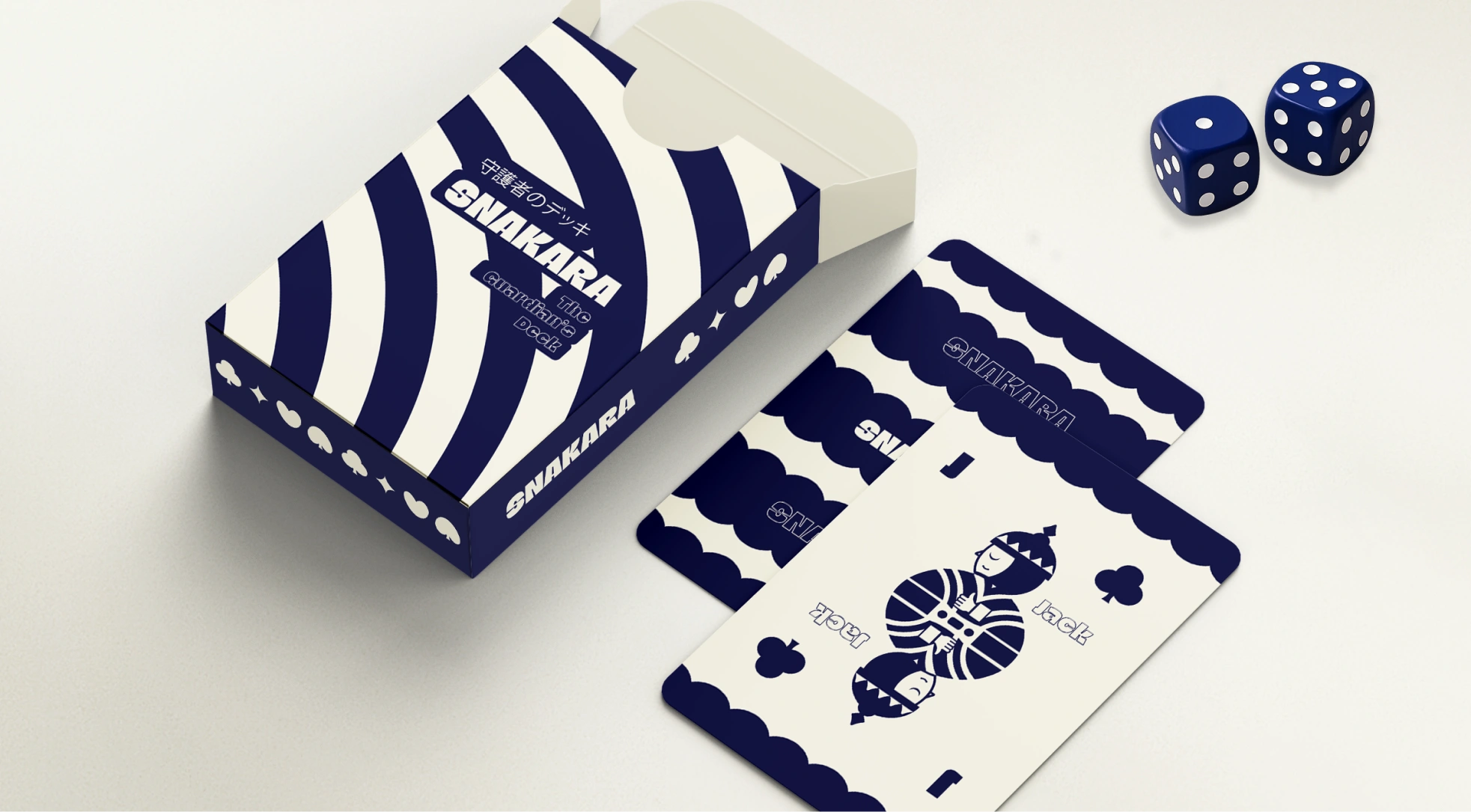
This image showcases **Snakara’s “The Guardian’s Deck”**, a clever brand collateral that turns a simple deck of cards into a storytelling device. Designed in Snakara’s signature navy and cream palette, the set features the brand’s iconic Samurai mascot reimagined as a playing-card character — disciplined, calm, and watchful.

The bold curves and geometric motifs mirror the packaging system, while the clean typography and minimal layout reinforce the brand’s modern sensibility. The tagline *“The Guardian’s Deck”* subtly ties back to Snakara’s ethos — mindful snacking guided by focus and control. It’s an inventive fusion of play and philosophy, turning even a deck of cards into an emblem of the brand’s identity and sharp design thinking.
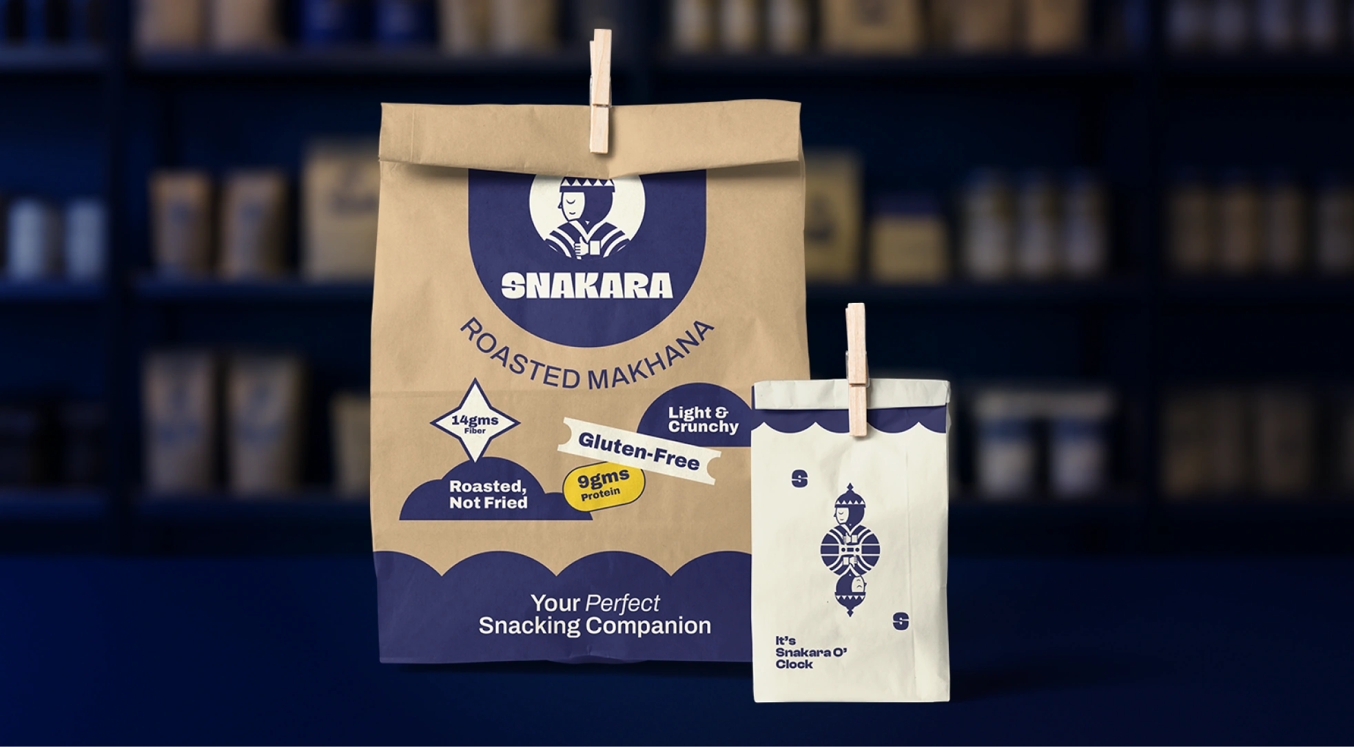
This image features **Snakara’s eco-friendly paper packaging**, showcasing the brand’s earthy yet modern design approach. The two-toned kraft and cream color palette blends natural authenticity with bold minimalism. The larger bag highlights Snakara’s roasted makhana range with playful graphic badges—*Gluten-Free, Light & Crunchy, 14g Fiber, 9g Protein, Roasted Not Fried*—while the smaller pouch carries the brand’s signature Samurai mascot with the phrase *“It’s Snakara O’Clock.”*

Together, they express Snakara’s philosophy of mindful snacking with joy and purpose. The packaging feels both artisanal and fresh, positioning the brand as an everyday healthy indulgence wrapped in thoughtful, sustainable design.

Start A Project

Let’s get to know each other. Share a few details to help us understand where you’re coming from

Thank you! Your submission has been received!
Oops! Something went wrong while submitting the form.
dot and grid wordmark