We began with a story. The world of Untamed was inspired by fortune tellers, celestial beings, and dreamlike rituals that blur the line between reality and imagination.
Naming
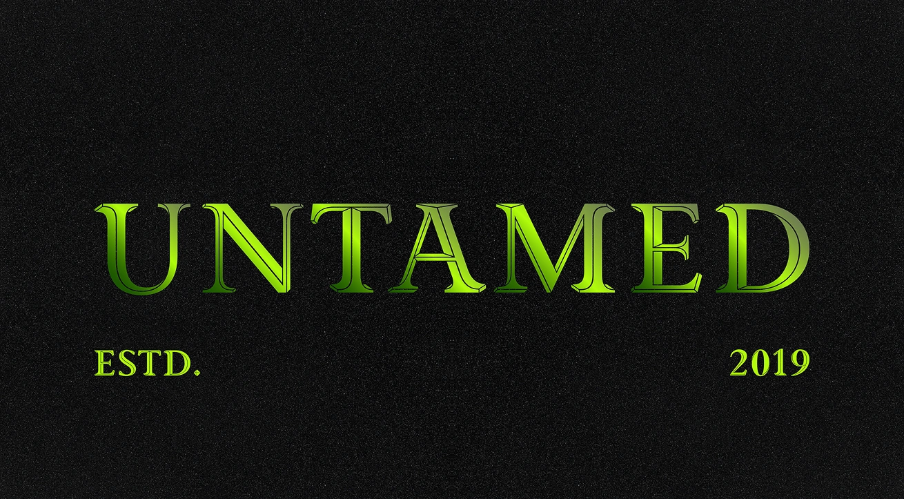
The word Untamed holds everything in place. It speaks to the wild nature of the flavours, the boldness of the drinker, and the refusal to play by anyone else’s rules.
Character Illustrations
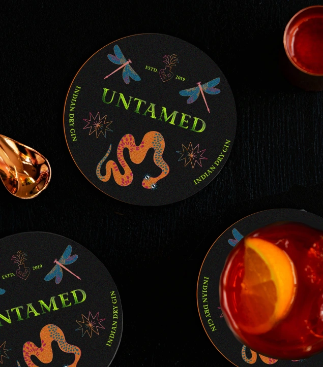
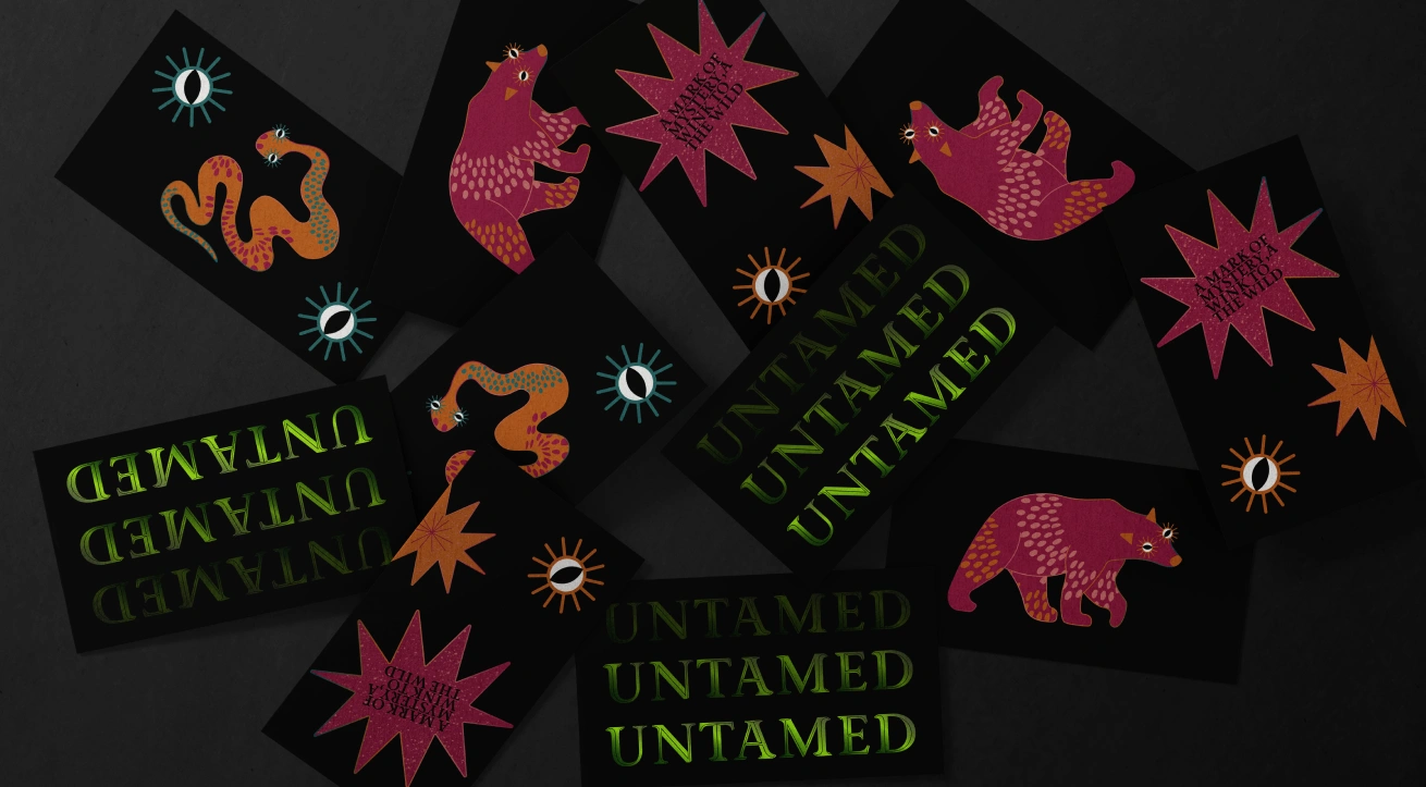
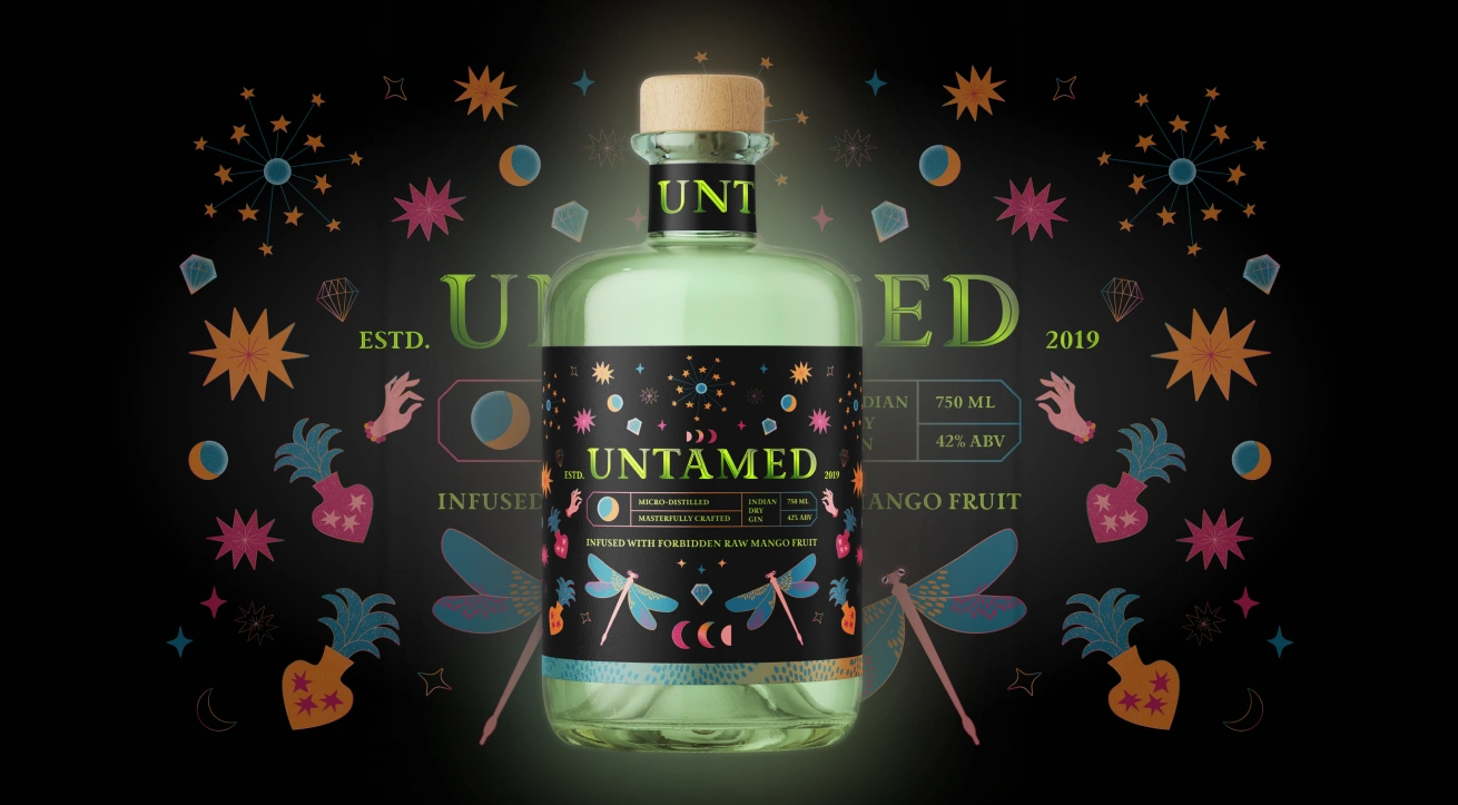
Each flavour features a central figure. Surreal, powerful, and watching. These characters are drawn by hand and digitally refined with mirrored forms, gradient outlines, and celestial detail. They act as visual guardians of the flavour, each telling its own story through posture, palette, and energy.
Label System
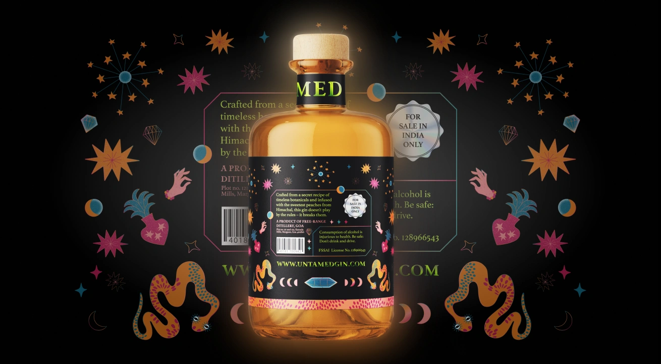
We created a mirrored layout using symmetry and balance to echo mystic traditions. The design holds space for layered patterns, glowing gradients, and iconography tied to each character’s identity.
Colour and Type
Neon green anchors the visual language. It cuts through darkness, grounding each label in a shared voice. The secondary colours shift with the fruit- electric peach, blood red, deep mango. Typography brings contrast, pairing a classic serif with slick, glowing accents that feel both refined and charged.
Touchpoints
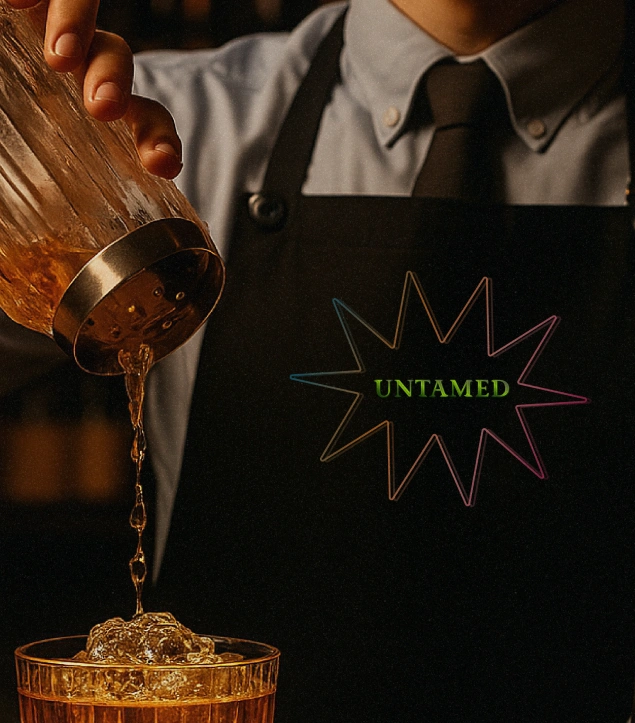
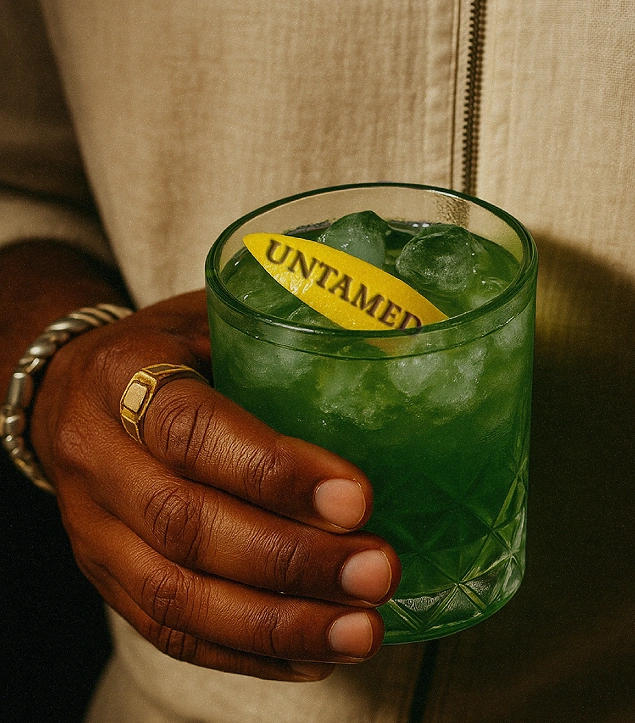
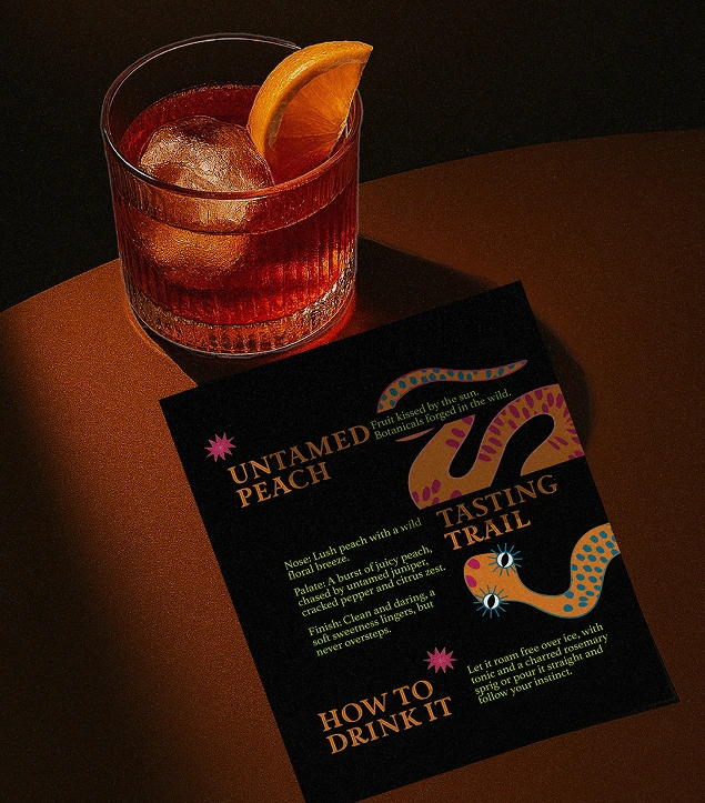
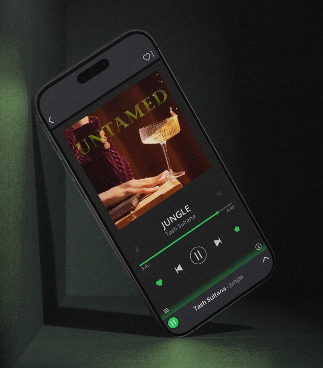
The brand lives across more than just the bottle. Posters, coasters, bar mats, and social templates extend the experience, turning every interaction into a moment of visual discovery.

.jpg)

